Logo Designs
Over the years I have created a number of logo designs. Here is a sample of my work over the years, including concepts that never made it to the public.
Raised With Christ
2022
Raised With Christ is a ministry focused on helping believers embrace their God-given Identity.
A crown representing Christ's position in the heavenlies. Violet for royalty.
MAD: Mutually Assured Desctruction
2020
MAD: Mutually Assured Desctruction is a board game for 4 players battling it out in Nuclear War.
The design features a mushroom cloud in the bold uppercase MAD.
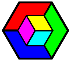
Tessellator Tile Map Editor
2014
Tessellator was a cross-platform tile-map editor for sprite-based games.
The project aimed to be best-in-class and support many maps and tile-types directly out-of-the-box. The hexagonal logo was designed to hint at the "T" in Tessellator and the support for exotic map types such as hexagons.
Xtreme Fabrication
2013
Xtreme Fabrication was a custom metal shop in Coeur d'Alene Idaho.
Complimentary colors against an edgy background are used to illustrate the concept.
This design never went public. The name was changed to start with an X rather than the conventional spelling.
Motion Brew Games
2013
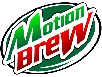
Motion Brew Games is a game studio working on several games for the mobile market.
A play on the similar sounding product Mountain Dew, it obviously wouldn't make it past any corporate lawyers worth their salt.
InnerWord
2011

The InnerWord logo was commissioned for a friend's blog focusing on the intersection between philosophy and theology.
The design was to combine the yin-yang with the Hebrew Aleph
A Leonardo d'Vinci inspired web design was part of the package, though that aspect of the design was not utilized.
Goal Victory
2010
Goal Victory was a web-based Goal Management system.
This design combines the concept of a goal (in the form of a target and arrow) with a capital "G."
TimeSync+
2010

TimeSync+ was a web-based user-interface for Oracle ERP Time and Labor and other Enterprise level TimeSheet products.
The application synchronized a local database with an enterprise database using an abstraction layer, allowing complete failover support.
This logo combines a database icon, clock and rotating circle graphic to illustrate the Synchronizatoin aspect of TimeSync+. The soft blue monochrome color-scheme worked nicely with the existing graphics in the application.
iris Color Picker
2009
Iris was a skinnable color-picker for the Windows System-tray.
The design combines an aperture with a color-wheel to illustrate the function of the program and evoke the idea of a closeable "iris."
ChromaCube
2009
ChromaCube was the original name of Iris (above).
This concept combines a color-cube and color wheel. Also hidden in the design is the capital "C" for "ChromaCube," an optical illusion in which the inner cube can be convex or concave or float back and forth between the two, and two popular color-schemes (RGB and CMYK).
As the web moved away from the importance of a web-safe color cube, the concept lost some of its relevance.
Amber Bug Tracker
2008
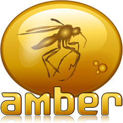
Amber was a web-based bug-tracking system in development in the late 2000s.
Goals for the project included determining a name for the project which would be catchy and fitting, but distinguish it from competing systems.
The concept of a "bug" stuck in amber seemed fitting for software of this kind and is apparently a unique use of the metaphor.
Theras: Therapy Assistant
2008

Theras was a Therapy tracking software for Medicare billing developed by Syngen Software.
Logo illustrates the concept of medical software by combining a stylized caduceus against a variation of the Syngen Software corporate logo.
Livin Green Store
2008


Livin Green was to be a store specialing in environmentally friendly products.
The short-lived project was to use logo below before it was discovered the name was already in use by a competitor.
The apple was one of several concepts created before the final logo was selected. I liked it, so here it is.
Mt Rose Chiropractic
2008

In this concept (one of several) I combined separate images of mountains and a rose to illustrate "Mt Rose"
For reasons unknown, this project never moved forward despite positive feedback from the customer. Logo seen here publicly for the first time.
Syngen Software
2007
Syngen Software developed Medicare billing software for Skilled Nursing Facilities.
Each "S" is turned on its side to serve double duty as the synergistic engine in "syngen."
Cyclops
2007
Cyclops was a database reader for the Profit Series POS.
Previous projects had taken on mythical names and Cyclops continued in this tradition.
In this concept, the "C" in Cyclops is used to create the illusion of a single eye.
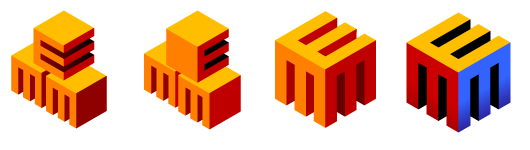
Enterprise Menu Manager
2007

EMM (Enterprise Menu Manager) is a software application for managing multiple restaurant menus in a single enterprise-level database.
Below are concepts on the way to final logo. My personal favorite is the third, with simple 90 degree corners. Client wanted rounded corners in final version.
Hospitality Solutions International (redesign)
2007
The HSI logo at the time spelled out the full company name (Hospitality Solutions International), even though the company was known as "HSI."
I was asked to create a logo solving this dilemma that would still be recognizable as a version of the same logo. I recreated the globe in illustrator based on a the original fixed-resolution raster, and carefully designed color versions for use on dark and light backgrounds as well as black and white and grayscale versions for various uses.
Profit Series
2006

Profit Series is a touchscreen Point-Of-Sale application by HSI.
The logo illustrates the touchscreen concept using the negative space created by the shape of hand against buttons forming a positive space.
Vectorstorm Web Design
2007

Vectorstorm was the web-design company I formed with a partner in 1998. From the beginning, our corporate color was violet.
I redesigned the logo to use a streamline storm vector forming a capital "V."
I was hoping to regain control over the vectorstorm.com domain, but it was and still is in the possession of a cyber-squatter.
Encompass Point of Sale
2004

Encompass was to be the name of the next-generation POS which would eventually replace Profit Series.
The name was abandoned for legal reasons.
This particular design joins the concept of a compass with the concentric half-circles which are an integral part of the HSI company logo.
ArrowStorm
2002
Arrowstorm was a computer consulting and development company headquartered in Arizona.
I designed company logo based on the owner's family crest, which includes three arrows shooting downward.
Griffin Property Management System
2001
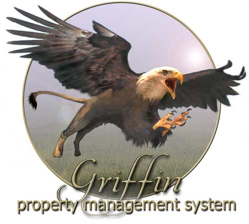
Griffin was a browser-based Property Management System designed specifically for touch-screen.
I was responsible for all graphics and html, in addition to much of the front-end javascript.
MindShare
1999
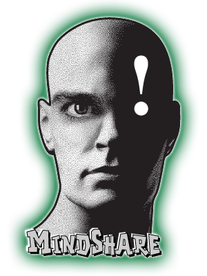
MindShare was a small symposium of technical instructors at New Horizons Coomputer Learning Center.
The design was used for promotional materials and t-shirts.
net Rx
1998

netRx was a computer network consulting firm formed in 1998 by some co-workers. They asked for blue and red in the design and a globe.